 点击查看原图 · 滚轮缩放 · 拖拽平移
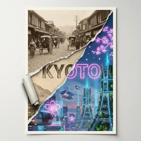
撕裂海报:对比京都两个时代
Torn Poster of Contrasting Kyoto Eras
生成对角撕裂的海报,展示 1920 年代怀旧与 2080 年赛博神道教城市的对比。
Create a [2:3] poster where the center is torn diagonally, revealing two contrasting eras of Kyoto. On the top-left torn layer, show Kyoto in the 1920s with sepia-toned streets, vintage rickshaws, and traditional machiya townhouses. On the bottom-right exposed layer, show a futuristic Kyoto in the year 2080, with hovering transit pods, holographic cherry blossom advertisements, and sleek vertical gardens integrated into cyber-shinto towers. The torn paper edges are crisp and textured, curling slightly to cast shadows. The word “KYOTO” spans across both eras in bold typography, transitioning from retro woodblock-style lettering on the left to sleek sci-fi neon kanji on the right. Soft studio light, high-resolution print-ready render, clean off-white border.